
Elegant Karin Font Free Download
Is Elegant Karin free to download?
Elegant Karin is a commercial font sold on Creative Market, so the full version needs a paid license. Get it from the official listing: Elegant Karin font download.
Need something free? These serif fonts from Google Fonts are free for personal and commercial use:
Design style
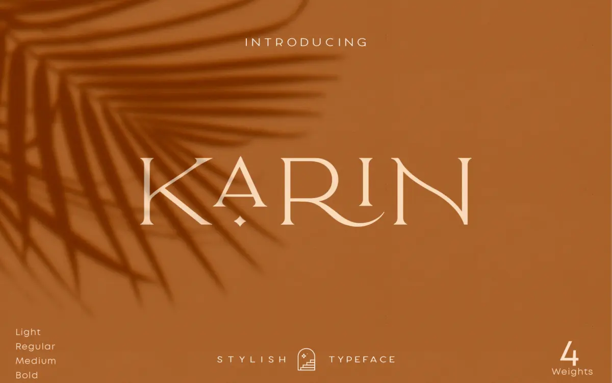
Elegant Karin sits in the well-worn but still useful territory of vintage-inspired serif display type: moderate contrast, slightly flared serifs, and a general air of old packaging or a reissued label. It doesn’t try to be a workhorse text face. The letters are drawn with a certain formality — upright, evenly spaced, more concerned with looking finished at a glance than with expressing personality stroke by stroke. That’s a reasonable choice for a font built to sit on a product box or a logo lockup rather than carry a paragraph.
The vintage label is doing real work here. There’s nothing aggressively contemporary about the shapes — no ink traps, no geometric reduction. It reads as a font designed to look like it’s been around, which is exactly the brief for a lot of the packaging and branding work it’s aimed at.
Character set and features
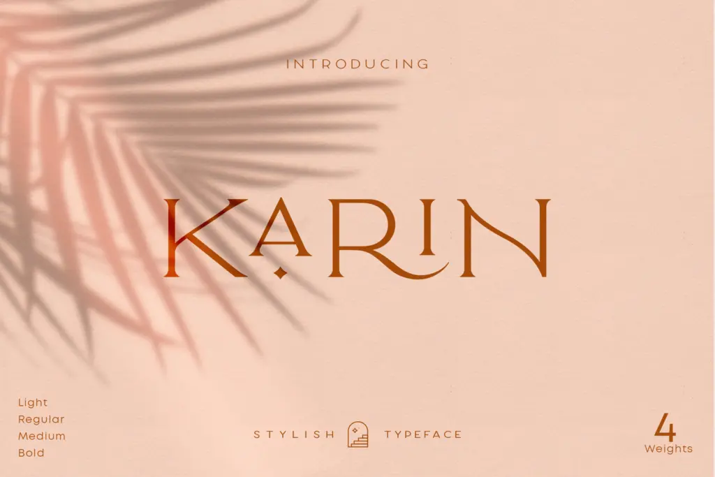
Elegant Karin ships as an all-caps design, which is worth being upfront about: there’s no lowercase to fall back on for body copy, so this is a display and headline tool, not a text font. It comes in four weights, giving some flexibility for hierarchy within a single branding system — a heavier cut for a wordmark, a lighter one for a supporting line underneath.
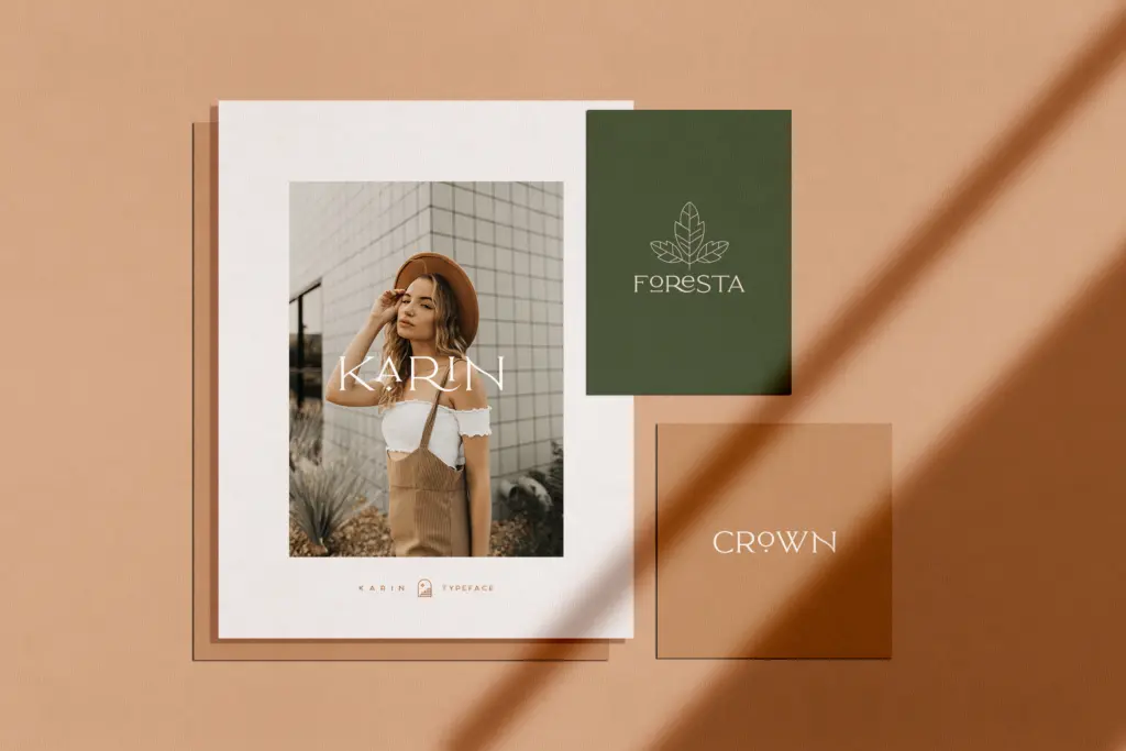
The set includes stylistic alternates and ligatures, along with ornaments, numerals, punctuation, and accented characters for multilingual support. The alternates matter more than they might seem to on paper: with an all-caps face, small variation between repeated letters is often the only thing keeping a long word from looking mechanical, and swapping in a few alternates on a wordmark can loosen that up. The ligatures and ornament glyphs are the kind of decorative extras that work well sparingly — a flourish on a monogram, a divider under a headline — but they’re easy to overuse, so restraint pays off. Access is through the standard glyphs panel in Illustrator or Photoshop rather than automatic OpenType substitution triggered by typing, so getting the most out of the alternates means manual glyph swapping rather than relying on stylistic sets to kick in.
Use cases
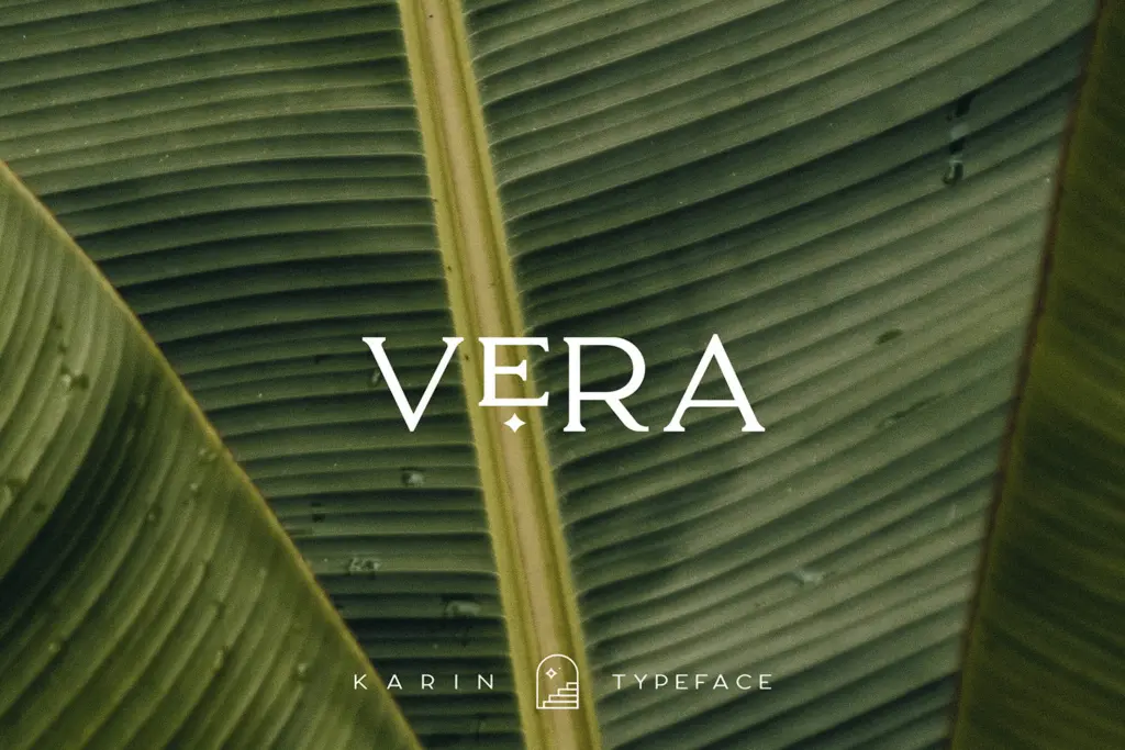
This is a font for short bursts of text: logotypes, product labels, packaging, magazine mastheads, or a line of type layered over a photograph. The four weights make it workable as the single typeface across a small branding system — headline, subhead, tagline — provided none of those roles require lowercase or long-form reading. It’s not suited to body copy, UI text, or anything that needs sentence case, and buyers should plan a pairing typeface for those jobs rather than expecting Elegant Karin to stretch into them.
For the intended use — a name on a bottle, a wordmark on a tote bag, a header on an editorial spread — it does the job cleanly, and the alternates give it enough variation to avoid looking stamped-out. Anyone needing a full lowercase alphabet, or a font that scales down to caption sizes, should look elsewhere.
What we liked, and what we didn’t
Strengths
- Four weights allow basic hierarchy within a branding system without switching typefaces
- Stylistic alternates and ligatures let repeated letters vary, avoiding a stamped-out look on wordmarks
- Accented characters support multilingual branding work out of the box
Trade-offs
- All-caps only, with no lowercase, so it can't function as a body text or long-copy face
- Alternates must be applied manually through the glyphs panel rather than via automatic OpenType features
Elegant Karin is a competent all-caps vintage serif suited to short branding moments — logos, packaging, headers — rather than anything requiring lowercase or extended reading. The four weights and glyph alternates give it some flexibility within that narrow lane, but it needs a pairing font for body copy. A solid, single-purpose tool rather than an all-rounder.

Tmfonts writes independent reviews of typefaces: what each font does well, where it falls short, what it suits, and where it is sold.