Sans Serif
3.6
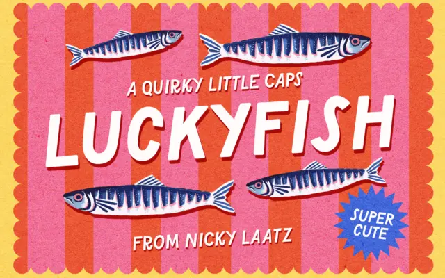
Lucky Fish: a loud all-caps sans for playful branding and cards
Design style Lucky Fish is an all-caps display sans built for noise, not nuance. The letterforms are chunky and slightly…
 Tmfonts

Design style Lucky Fish is an all-caps display sans built for noise, not nuance. The letterforms are chunky and slightly…
Tmfonts
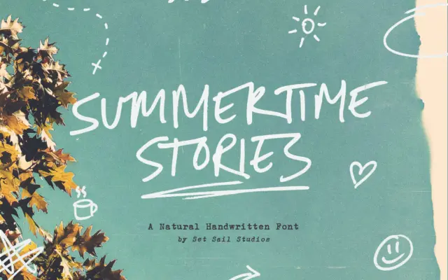
Design style Summertime Stories is an all-caps script drawn with a real pen, and it shows. The strokes wobble slightly…
Tmfonts
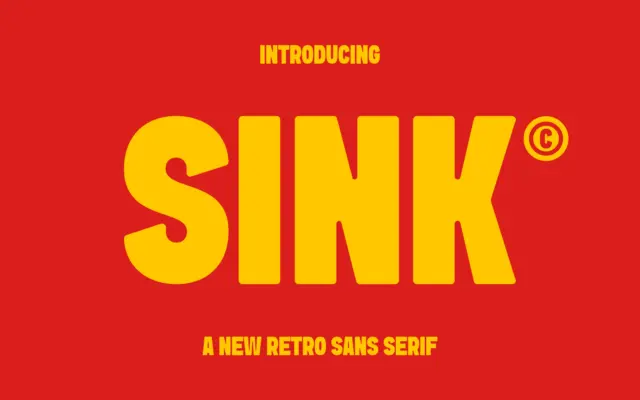
Design style Sink sits in that familiar territory of heavyweight retro sans faces: thick strokes, low contrast, and a general…
Tmfonts
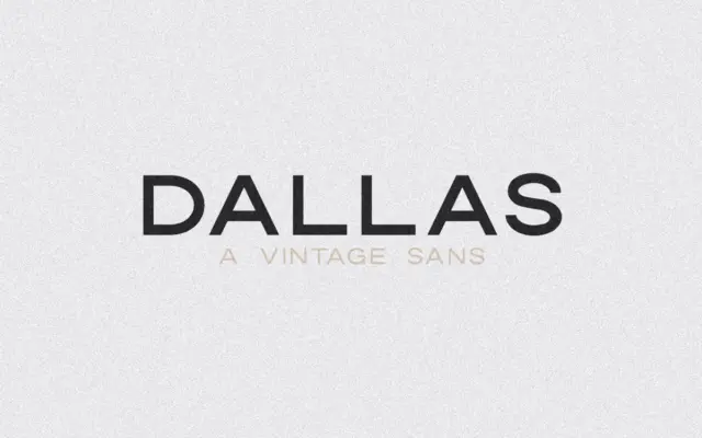
Design style Dallas is an uppercase-only sans with the slightly squared, workmanlike look of mid-century signage lettering. The forms are…
Tmfonts
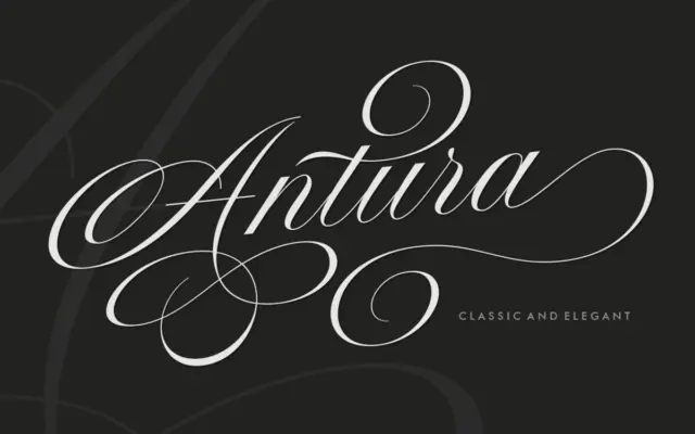
Design style Antura Script sits in the copperplate-revival family that has become crowded over the last decade, but it leans…
Tmfonts
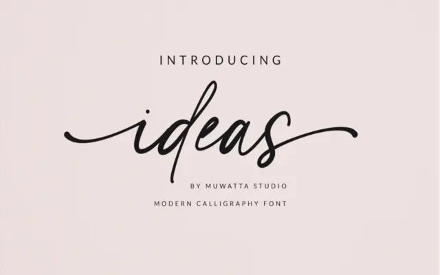
Design style Ideas belongs to the crowded field of casual-formal scripts that split the difference between calligraphy and handwriting. The…
Tmfonts
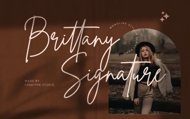
Design style Brittany Signature Script belongs to the signature-script family that has become a marketplace staple: fast, inky strokes that…
Tmfonts
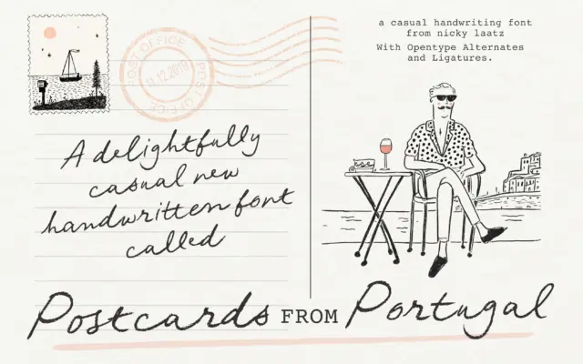
Design style Postcards From Portugal is a penned script built on an unsteady, deliberately imperfect baseline. The strokes carry the…
Tmfonts
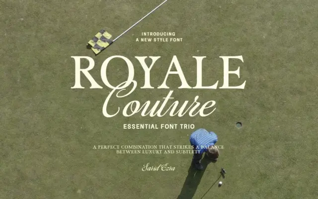
Design style Royale Couture is built as a set from the start rather than three fonts stitched together after the…
Tmfonts