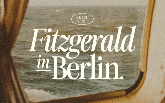
Fitzgerald: a retro serif built for logos and short editorial runs
Design style Fitzgerald sits in that familiar corner of type design where nineteenth-century didone proportions get sanded down for present-day…
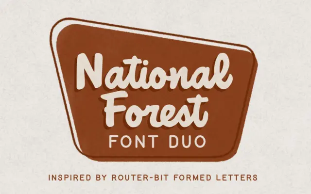
Design style National Forest takes its cue from the carved wooden signage found at national park entrances and trailheads, the…
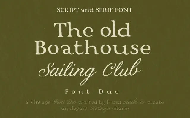
Design style This is a two-piece set built around a single mood: old money without the shout. The serif half…
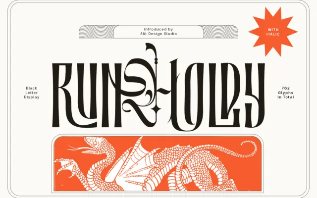
Design style Runholdy sits at the crossing of two traditions that don’t usually meet. The bones are blackletter — broken,…
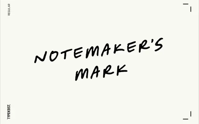
Design style Notemaker’s Mark reads like something jotted down mid-thought rather than penned with any ceremony. The letters lean forward…
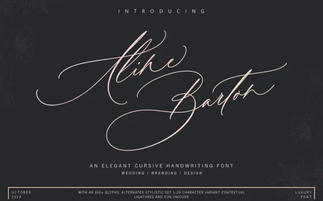
Design style Aline Barton belongs to the crowded family of brush-flavoured connecting scripts, but it leans harder into ornament than…
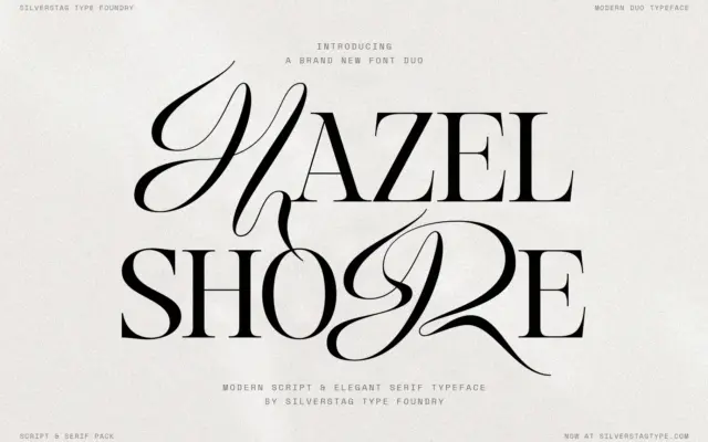
Design style Hazel Shore is a high contrast display serif drawn alongside a matching italic and a separate flowing script,…
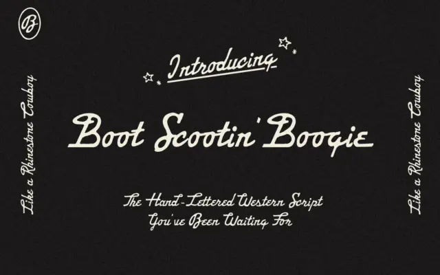
Design style Boot Scootin’ Boogie Script is a hand-lettered script that leans hard into a Western, honky-tonk mood. The strokes…
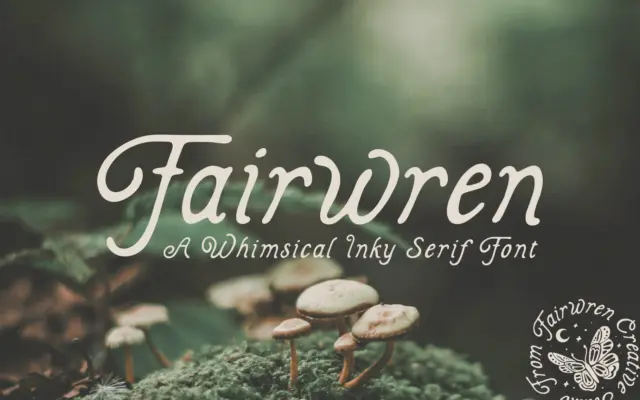
Design style Fairwren is a display serif built around an inked, slightly ragged edge rather than a clean vector outline.…