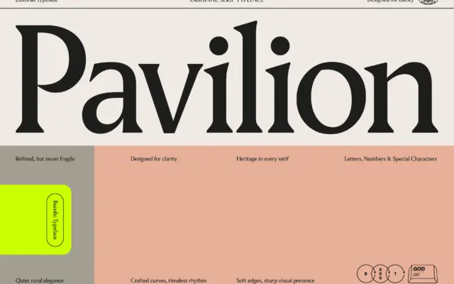
Pavilion Serif: a single-weight editorial serif for headlines and short copy
Design style Pavilion sits in the modern-meets-traditional serif camp: bracketed but crisp cuts, moderate stroke contrast, and a structure that…
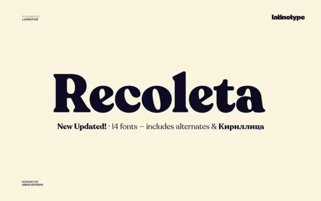
Design style Recoleta belongs to the soft-serif revival that took cues from 1970s display faces like Cooper and Windsor without…
Design style Belvare sits in that familiar seam between vintage advertising lettering and current editorial serif revival. The condensed proportions…
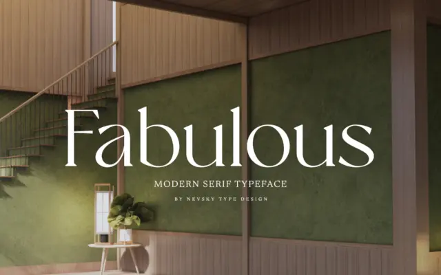
Design style NT Fabulous belongs to the current wave of high-contrast serifs built for luxury and fashion branding, where thin…
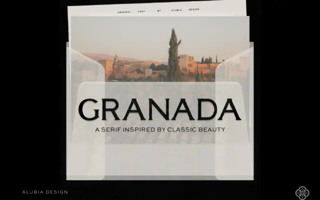
Design style Granada is a high-contrast serif built for the top of a page rather than the body of one.…
Design style Commuters Sans sits in the geometric-humanist middle ground that a lot of contemporary sans families now occupy, but…
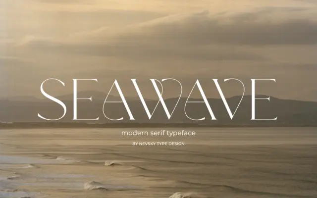
Design style NT Seawave belongs to the family of high-contrast serifs that trace back to Didone models but push the…
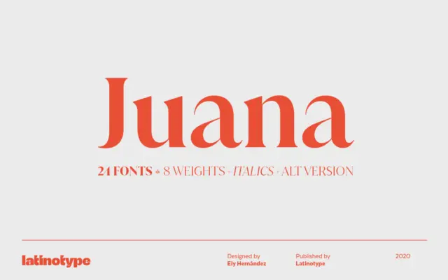
Design style Juana is a serif built on extremes. The contrast between thick and thin strokes is pushed hard, giving…
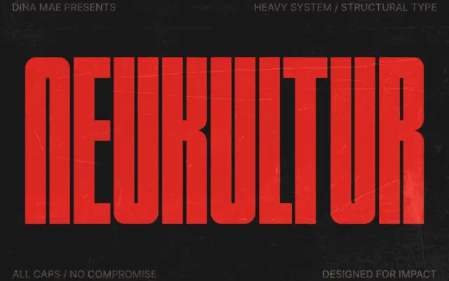
Design style NEUKULTUR is a bold, compressed, all-caps display face built for situations where horizontal space is scarce and the…