Script
3.9
Perfections: a smooth romantic script for weddings and boutique branding
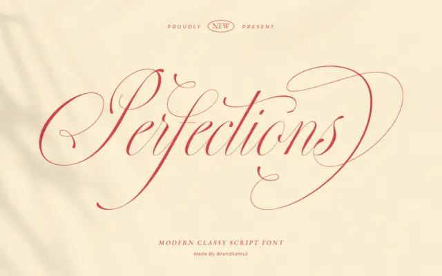
Design style Perfections sits comfortably in the crowded lane of romantic calligraphy scripts, and it knows exactly what it’s doing…
 Tmfonts

Design style Perfections sits comfortably in the crowded lane of romantic calligraphy scripts, and it knows exactly what it’s doing…
Tmfonts
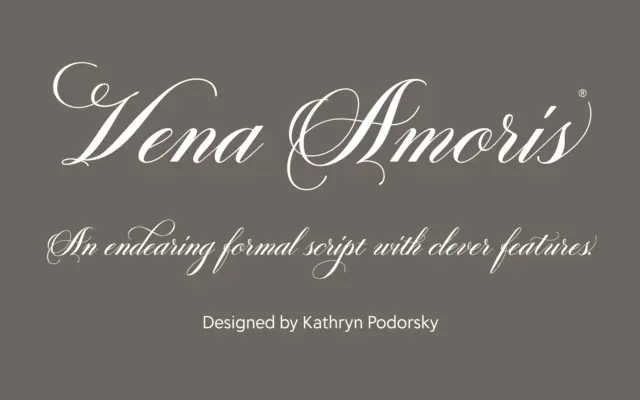
Design style Vena Amoris sits in the copperplate tradition: high contrast strokes, a pronounced slant, and the kind of pointed-pen…
Tmfonts
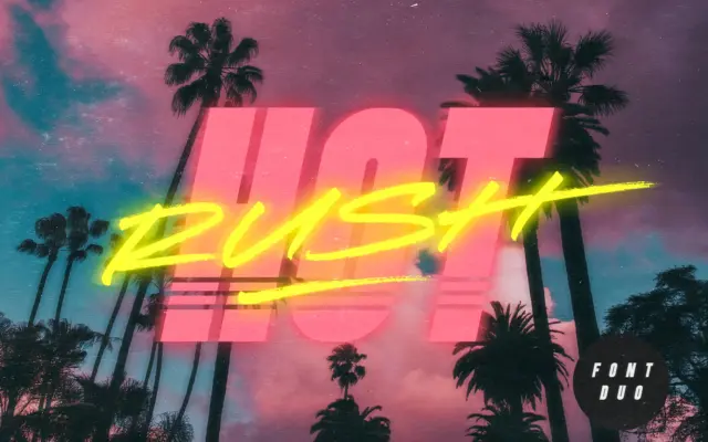
Design style Hot Rush is built for one job: retro impact. The duo pairs a condensed, uppercase-only sans with a…
Tmfonts
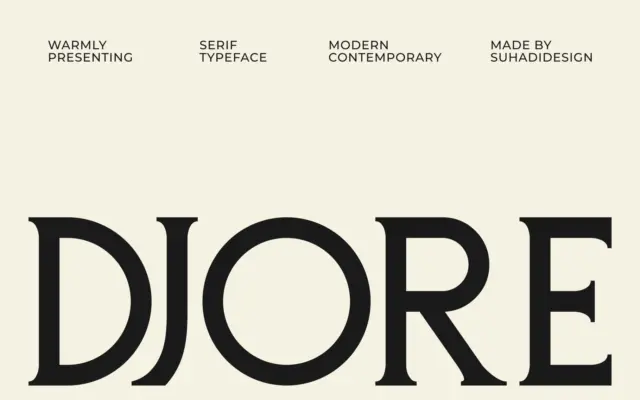
Design style Djore sits in the current wave of high-contrast editorial serifs, the kind you see on fashion mastheads and…
Tmfonts
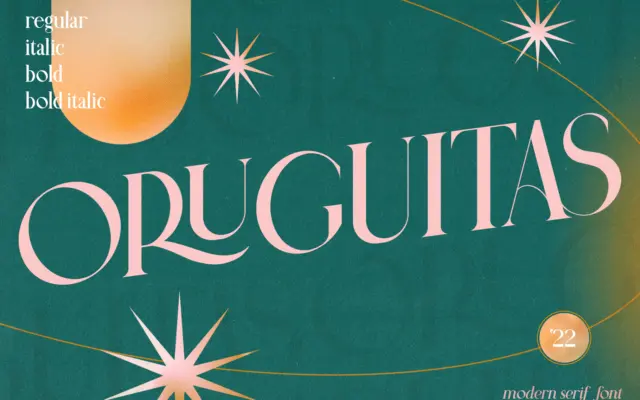
Design style Oruguitas sits in the high-contrast modern serif camp: thin hairlines snap against thick stems, giving the letterforms a…
Tmfonts
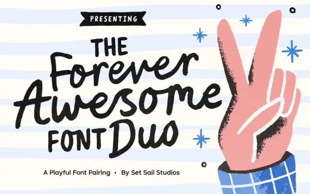
Design style Forever Awesome is a hand-drawn duo built around a bouncy, slightly wobbly script paired with a companion all-caps…
Tmfonts
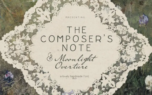
Design style This is a bundle of three related but distinct hands: a typewriter-inflected sans, a flowing ink script, and…
Tmfonts
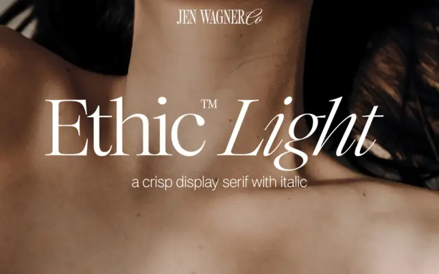
Design style Ethic Light sits in the lighter end of the display serif family, built around fine hairlines and modest…
Tmfonts
Design style Jalisco & Marlowe is a two-face pairing built around a familiar branding formula: one loud display face, one…
Tmfonts