Sans Serif
3.9
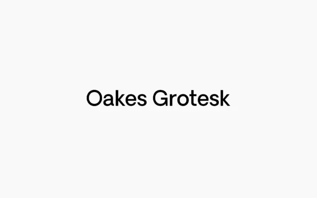
Oakes Grotesk: a corporate sans built for body copy, not just headlines
Design style Oakes Grotesk is the more buttoned-down sibling of Studio Few’s original Oakes typeface, and the family reads as…
 Tmfonts

Design style Oakes Grotesk is the more buttoned-down sibling of Studio Few’s original Oakes typeface, and the family reads as…
Tmfonts
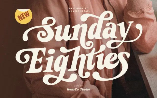
Design style Sunday Eighties leans into the thick-and-thin theatrics of 1970s and 80s signage lettering. The serifs are chunky, the…
Tmfonts
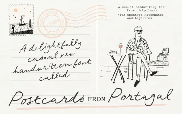
Design style Postcards From Portugal is a penned script built on an unsteady, deliberately imperfect baseline. The strokes carry the…
Tmfonts
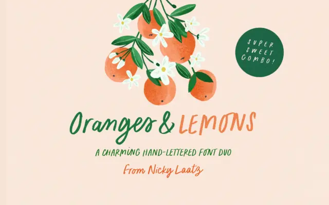
Design style Oranges & Lemons is a two-piece set built around a single idea: informal, marker-drawn lettering that reads as…
Tmfonts
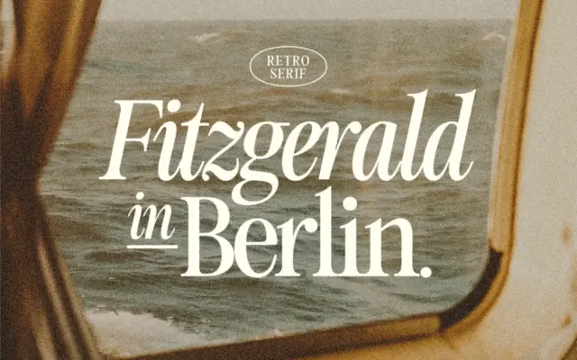
Design style Fitzgerald sits in that familiar corner of type design where nineteenth-century didone proportions get sanded down for present-day…
Tmfonts
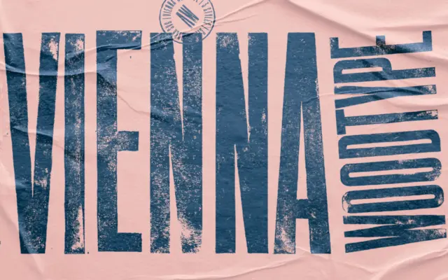
Design style Vienna Woodtype announces its process before you even read a word: these are letterforms carved into linoleum, hand-printed,…
Tmfonts
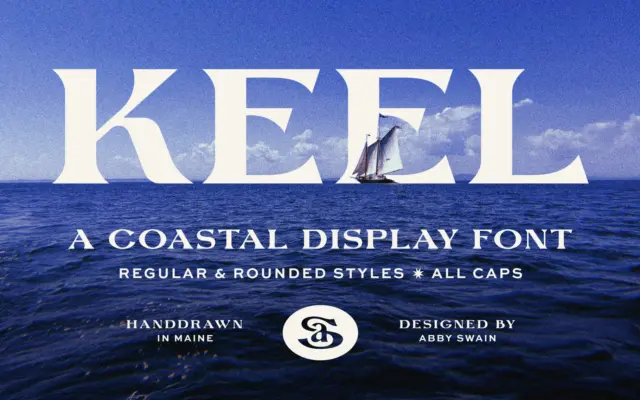
Design style Keel is a display serif built on the kind of irregularity that only comes from drawing letters by…
Tmfonts
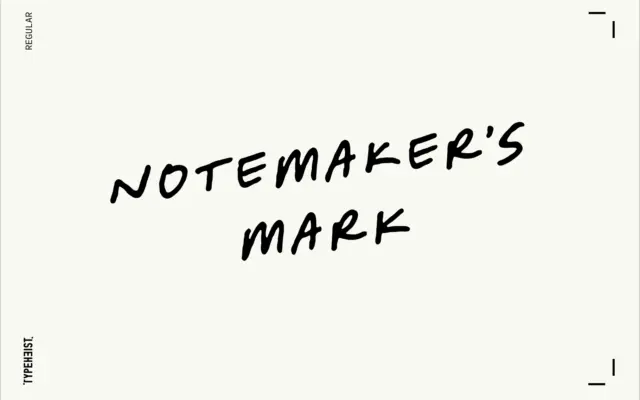
Design style Notemaker’s Mark reads like something jotted down mid-thought rather than penned with any ceremony. The letters lean forward…
Tmfonts
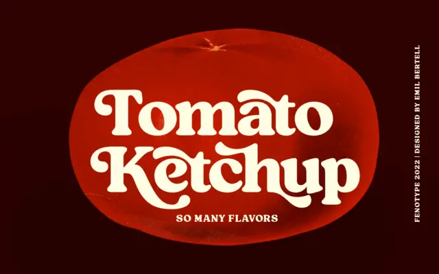
Design style Tomato Ketchup is a heavyweight vintage serif with the kind of stocky, confident stroke you’d expect from a…
Tmfonts