
Recoleta: a soft-serif workhorse for branding and headlines
Design style
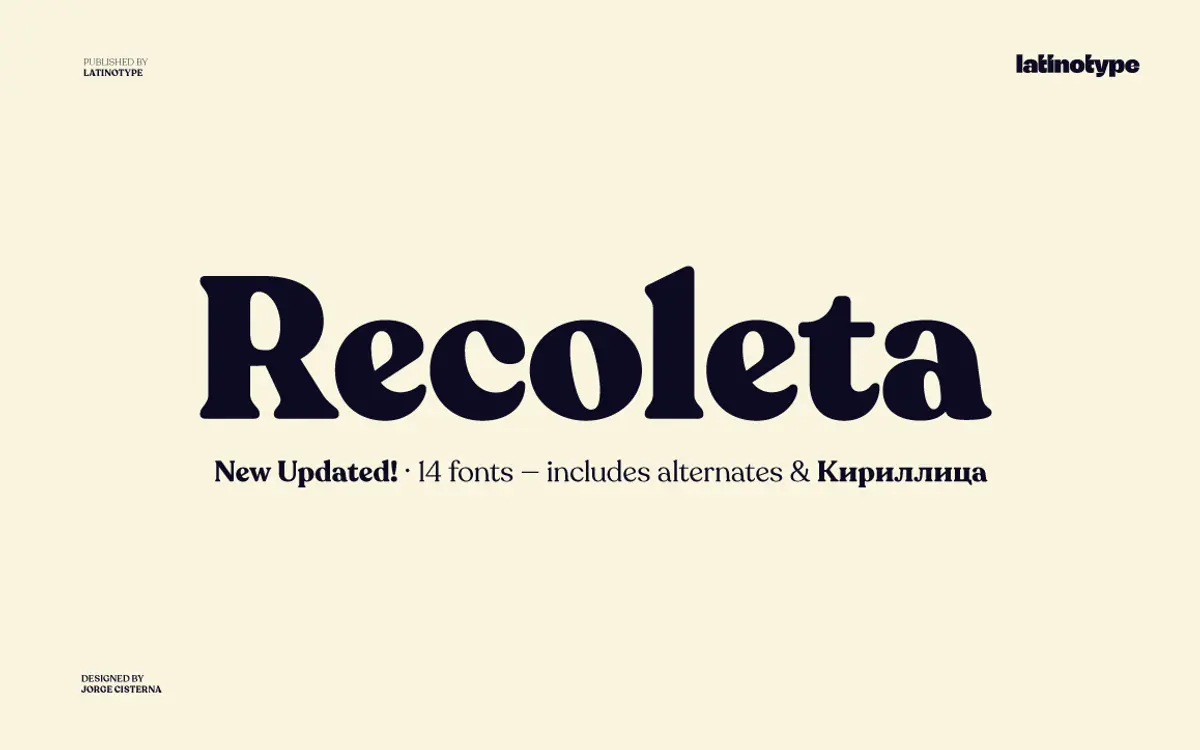
Recoleta belongs to the soft-serif revival that took cues from 1970s display faces like Cooper and Windsor without copying either. The rounded terminals and gently swelling strokes give it a warm, slightly retro character, but the drawing is cleaner and more restrained than its inspirations. Curves are fuller than a typical text serif, joins are soft rather than sharp, and the serifs themselves are stubby, almost bracketless nubs rather than pronounced hooks. The result reads as friendly without tipping into novelty.
What keeps Recoleta from feeling dated is its discipline. The x-height is generous, the counters are open, and the overall rhythm is even across the family. It has personality but doesn’t shout it at every letter — the lowercase ‘g’ and ‘a’ carry most of the character, while the rest of the alphabet stays fairly quiet and lets the weight and spacing do the work.
Character set and features
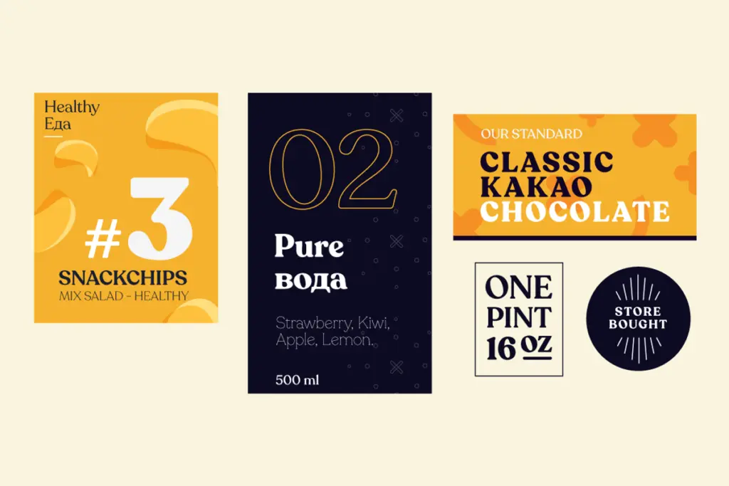
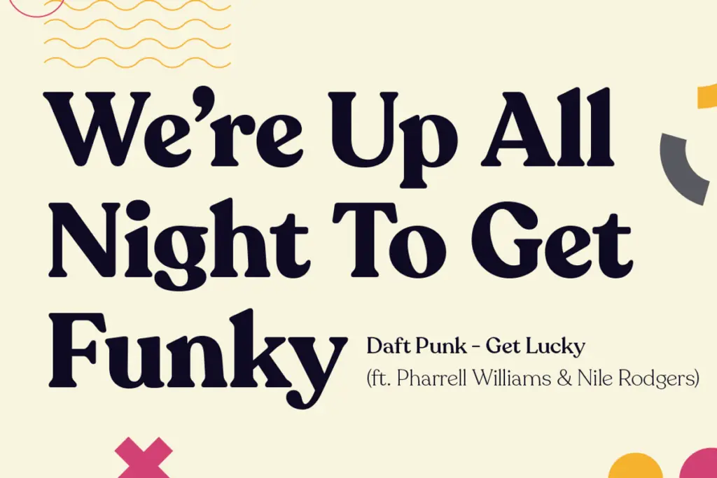
The family spans a full weight range, from light through black, which is really the point of Recoleta: the lighter cuts are calm enough for setting body copy or captions, while the heavier weights turn the same soft shapes into confident, high-impact headline type. That range in one coherent design is unusual for a serif with this much personality — most soft-serifs top out at two or three weights.
Stylistic alternates are the other reason people reach for this family. Swapped characters — particularly in the lowercase — give logotypes and short headline settings a less generic look than the default letterforms, and they’re accessible through OpenType so they drop in cleanly in apps that support the feature. Cyrillic support has been added, which extends the family’s reach for anyone working across Latin and Cyrillic markets in a single job.
Numerals and punctuation follow the same soft treatment as the letters, so tabular data or price lists won’t feel like an afterthought bolted onto a display face. It’s not an exotic character set — no swash flourishes, no decorative extras beyond the alternates — but what’s there is consistent and well finished.
Use cases
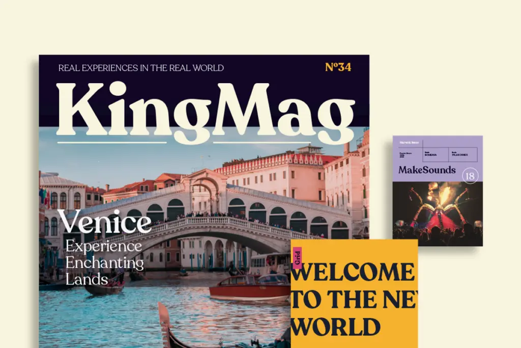
Recoleta’s natural home is branding: logotypes, packaging lockups, editorial mastheads, anything that needs a serif with warmth rather than gravitas. The heavier weights make confident headlines for magazines, posters, or app onboarding screens where a sans would feel cold and a traditional serif too formal. The lighter weights can carry short paragraphs — pull quotes, intro copy, subheads — though I wouldn’t set long-form body text in it; the softness that makes it appealing at large sizes starts to blur at small ones.
It pairs well in identity systems where you want one typeface to do both the wordmark and the supporting headlines, cutting down on the need to source a separate display face. For anything requiring a neutral, invisible workhorse — dense body text, legal copy, data-heavy interfaces — it’s the wrong tool; Recoleta wants to be seen, just not loudly.
What we liked, and what we didn’t
Strengths
- Full weight range lets one family cover both headline and short-text duties
- Stylistic alternates give logotypes a distinct look without extra typefaces
- Cyrillic support extends its use across more markets
Trade-offs
- Softness that reads well at display size loses clarity in long body text
- The retro warmth won't suit brands wanting a neutral or austere serif
Recoleta takes a familiar 1970s soft-serif mood and disciplines it into a genuinely usable branding and headline family. It's not built for long-form text and the character isn't for every project, but within its lane — logos, packaging, editorial headlines — it's a dependable, well-drawn choice.
Verdict

Tmfonts reviews typefaces in depth — every font is tested in real branding, editorial and screen layouts before a word gets written. 555+ fonts reviewed and counting.