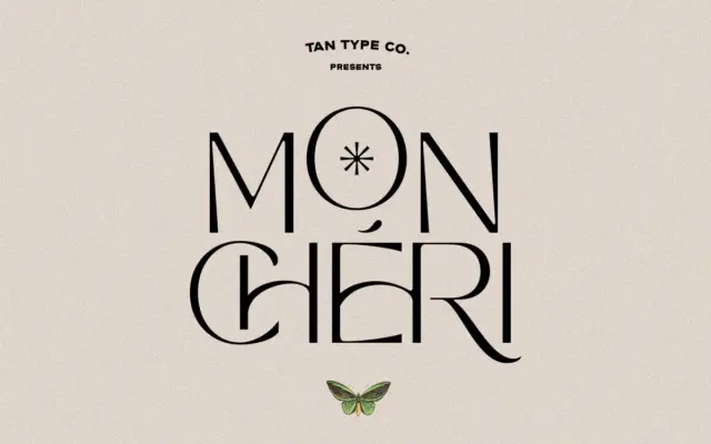
TAN – Mon Cheri: a clean 60s-inflected sans with playful ligatures
Design style Mon Cheri sits in that familiar TanType territory: geometric-leaning sans letterforms with a retro sensibility, pitched somewhere between…
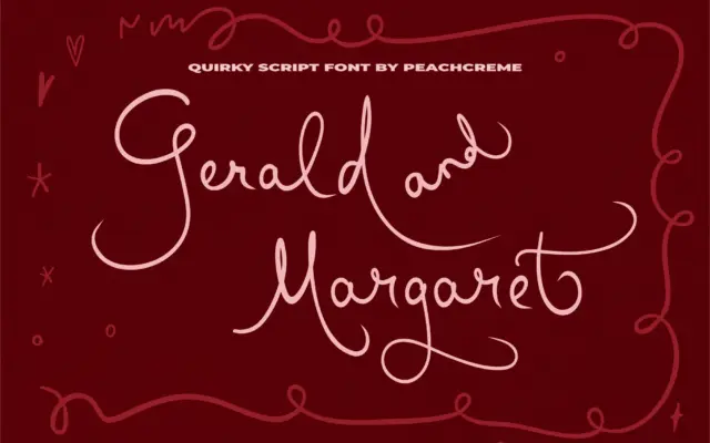
Design style Gerald and Margaret sits in the casual end of the script spectrum, closer to a felt-tip note than…
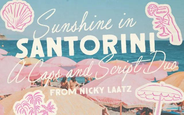
Design style Santorini Sunshine pairs a loose, slightly imperfect script with a rough-edged all-caps sans, both pulling from mid-century signage…
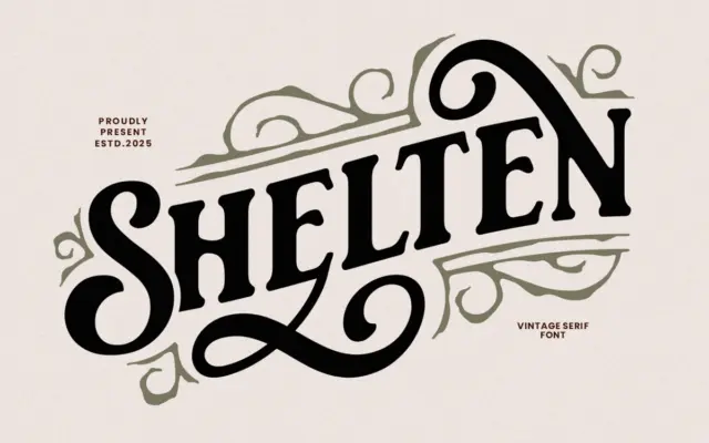
Design style Shelten Font Vintage sits in the well-worn category of hand-inked revival serifs, the kind meant to evoke old…
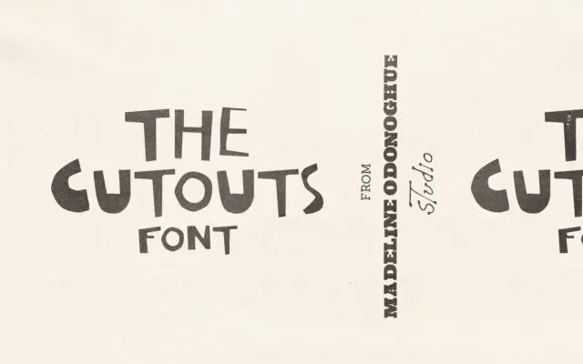
Design style The Cutouts is built from paper, not pen strokes, and it looks it. Every uppercase letter was cut…
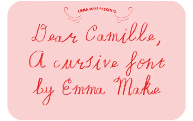
Design style Dear Camille is built around the idea of a pencil-crayon line rather than a pen nib. The strokes…
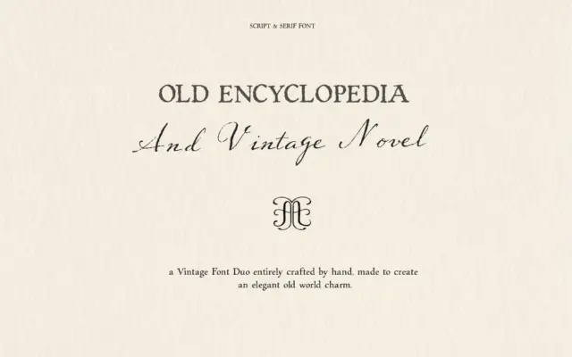
Design style This is a two-font bundle built around a single idea: everything should look like it was written by…
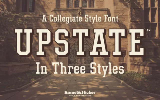
Design style Upstate is built on the same bones as old varsity block lettering: thick, squared-off slabs, angular joins, and…
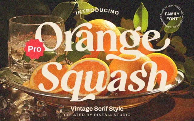
Design style Orange Squash Pro leans into a 70s-flavoured vintage serif look: thick, blunt slab-like serifs paired with curves that…